
I run with a wrist-based heart rate monitor. Some days it’s fine. Some days it isn’t.
In the depths of a winter, I went out for an easy recovery run. Three or four miles, conversation pace, nothing pushed. About a mile in, the watch started telling me my heart rate was 178. I wasn’t working that hard. Not even close.
I knew it was wrong because I knew what easy felt like. My breath was steady. My legs were loose. That’s a 130, maybe 135. Not a 178. The watch was lying.
That’s how I ran for the better part of a year. Override the watch when it didn’t match what I felt. Adjust on the fly.
Eventually I bought a chest strap.
I was tired of doing the math in my head every time I looked down. I wanted a number I could trust without having to override it.
That’s where most B2B email teams are right now. The wrist data is broken. They’re either still letting it drive, or they’re doing the mental math on every report. Neither one scales.
I’ve been doing marketing operations long enough to watch the measurement model break a few times. Something gets noisier. The benchmarks slip. You adjust and move on.
This round went deeper. I just went through it.
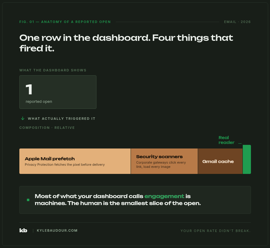
Open rates were the headline metric. Open rates drove the narrative. Open rates fed the lead scoring model. Open rates defined who counted as engaged and who got sunset.
Then I went looking for the noise.
Apple Mail Privacy Protection was inflating roughly half of our reported opens. Add corporate security scanners prefetching every link before a human ever saw it, plus Gmail’s quiet image caching, and the picture got worse fast. The open rate we’d been reporting was probably half real. The top-performing nurture, the one we’d cited in three different leadership readouts, lost most of its claimed wins once we pulled the bot activity out.
The first reaction was the right one. Stop reporting opens. Move to clicks. Weight clicks higher in the lead score and audit the nurture triggers.
That fixed the dashboard.
It didn’t fix the operating system.
Here’s the thing I didn’t fully see until I was a few weeks in.
We hadn’t lost a metric. We’d lost a load-bearing wall.
Open rates weren’t sitting on a dashboard somewhere being decorative. They were holding up the building. The nurture series fired off opens. The lead scoring model added points for opens. The sunset policy removed contacts based on opens. The engaged-segment definition was built on opens. The sales team got “lead opened your email” notifications and called it a buying signal.
When opens broke, all of that broke with them. Quietly. The dashboards still produced numbers. The automation still ran. None of it was carrying the weight it claimed to carry.
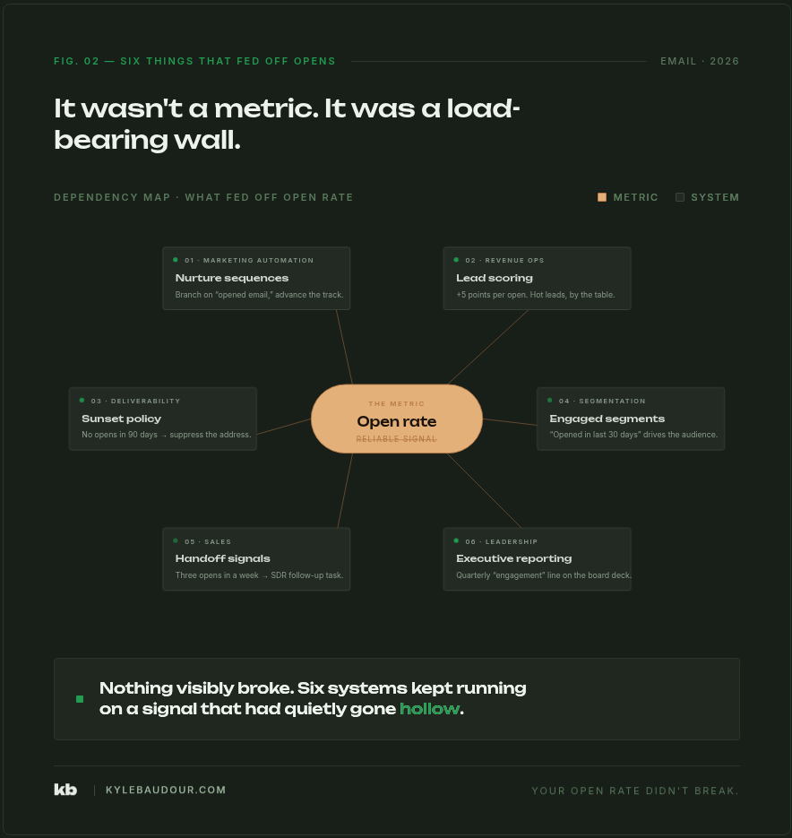
That’s the hard part. Nothing visibly fell down. The operating system kept humming. The numbers it produced were just less and less connected to anything real.
You wouldn’t trust a heart rate monitor that was right 80% of the time.
You definitely wouldn’t trust one that was right 50% of the time.
That’s where opens have been for years. Most of us are still letting the watch drive the run, or running by feel and calling that a strategy.
Neither one is the answer. The chest strap is the answer. You stop compensating, and you build instruments you can actually trust.
Over the next two posts, the rebuild.
The first follow-up is where the work actually lives. Five places open-rate rot is still hiding in your marketing automation, even after you’ve stopped reporting opens to leadership, plus what multi-signal engagement scoring actually looks like in practice without breaking the lead routing your sales team is already running on.
The second is the executive narrative. The one slide that should replace open rate in your monthly marketing review, and what pipeline-influenced reporting actually looks like when it’s the headline instead of the asterisk at the bottom of the deck. The story you walk in with when opens come off the top.
Each layer is recoverable. None of this is dramatic if you do it on purpose instead of letting it leak in slow motion.
The thing I tell myself on a long run when the watch is lying is that the trail still tells the truth. The grade is still the grade. My breath is still my breath. The watch is one input, and when it goes off, the run goes on by feel.
Until you can build the better monitor.
That’s the move with email too. The data you’ve been steering by got noisy. The signals you can actually trust are still there. They were always there. We just got lazy because the watch was easier to read.
Time to build the chest strap.